Did Pantone’s® 2021 Colors of the Year speak directly to your very soul? Do they vibrate at your frequency? Did you slap yo’ mama when you saw the duet? Did you find yourself staring at the ultimate, illuminating color paring you’ve ever seen? (Yes, obvious joke intended.) We feel you.
Every year since Y2K (yeah, remember Y2K?), approximately 121.37 gazillion people around the world look forward to the release of Pantone’s® Color of the Year. True, Pantone® probably wasn’t the first company to declare a color-of-the-year, but they’ve definitely become the biggest. Color geeks and nerds will notice that 2021 is only the second time in history that Pantone® chose a coupling of colors instead of a single color. The last was five years ago, in 2016, when Pantone® teamed babies boy blue & girl pink (aka, rose quartz & serenity) in a charming newborn-twins palette plucked straight out of their nursery. It was a hit.
Again, with this year’s duo, Pantone® has doubled down (Oh, no. Not puns.) on their previous pair up success, and, with equal verve. So … for you interior decorators, DIYers, and everyone in between … if you stan for Ultimate Gray and Illuminating, dive with us into a thought experiment about how to integrate this year’s colors at home. Now, let’s get personal.
What is Pantone®?
Pantone® provides a universal language of color that ... leveraging advanced X-Rite technology to achieve color consistency across various materials and finishes ... enables color-critical decisions through every stage of the workflow for brands and manufacturers.
Since 2000, Pantone’s color experts at the Pantone Color Institute comb the world looking for new color influences. The selection process requires thoughtful consideration and trend analysis, including the entertainment industry and films in production, traveling art collections and new artists, fashion, all areas of design, popular travel destinations, as well as new lifestyles, play styles, and socio-economic conditions. Influences may also stem from new technologies, materials, textures, and effects that impact color, relevant social media platforms and even upcoming sporting events that capture worldwide attention.
Twice a year Pantone hosts, in a European capital, a secret meeting of representatives from various nations’ color standards groups. After two days of presentations and debate, they choose a color for the following year.
~Excerpted from Pantone.com
ILLUMINATING – PANTONE® 13-0647 TCX
One of the best, easiest, and time-tested ways to incorporate any color into a room is to paint. Painting is (for the most part) easily reversible, inexpensive, and quick. Repaint a piece of furniture, a wall, part of a wall, or add a design to a wall. Are you a muralist? Paint a field of dandelion blooms cutting sharply through the haze of a foggy lakeshore. Not that skilled? Pick up a set of circular painter’s canvases and cover your wall in Illuminating polka dots. Feeling bold, grab your roll of blue painter’s tape and pop up some strategic racing stripes like we did.
NEVER FEAR, PANTONE® IS HERE.
Why do we say this? Some people will be afraid to paint an entire wall in Illuminating yellow for fear it will overtake the room. Here is where the true brilliance of this color shines thru. Illuminating falls just left of center on the green-to-red pigment spectrum. You color theorists will know that means Illuminating is what interior decorators would call a “retreating” yellow. So, indulge yourself at will with this one. It will not result in your room feeling smaller or overwhelmed by the color. Wait, let’s rephrase that. Alone, an Illuminating wall isn’t likely to advance on you, but, if you paint everything this color, it will be, in the words of Project Runway’s Tim Gunn, “…a lot of look.”
Pro Tip #1: Paint Structural Elements.
Painting a permanent or semi-permanent structure sells a look or style better than simply adding furniture or decor in a color. It removes any suspicion that the palette and design is incidental or accidental. When the look comes together it silently screams, “Hell yes, I meant every bit of this and, as you can see, I know my sh*t, thank you!” For example, painting this decorative fireplace frame leaves little doubt that we knew precisely what we were doing and the look we were going for.
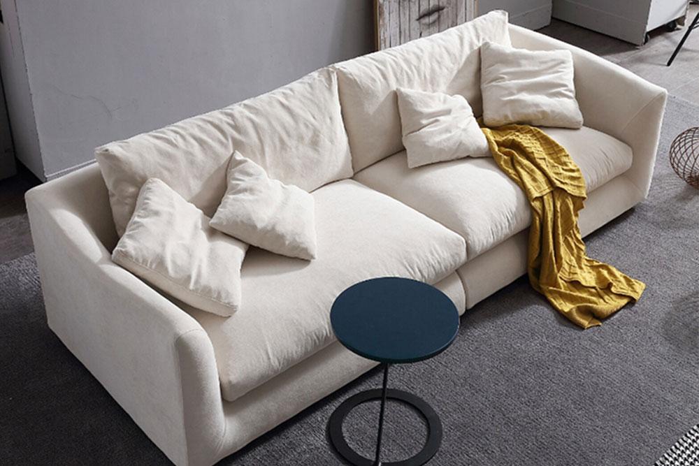
Valyou's Feathers Collection
In these images we’ve leveraged one of many wonderful features that we intentionally designed into our Feathers Collection and that we know you either already love or will soon … interchangeable upholstery. Today, this washable upholstery can be purchased in over 20 colors from tame to bold, from familiar to fabulous … to match every personality. Did you buy it in Dark Gray? As we’ve just seen, that works. Want to change it up? You can.
Looking for the skinny on a shagadelic 70s vibe, order yourself new upholstery in a retro color like Rust and we’ll catch you on the flip side.
Wanna get your crib poppin’? Pimp it out in a royal aubergine that not everyone can pull off … but we both know you can!
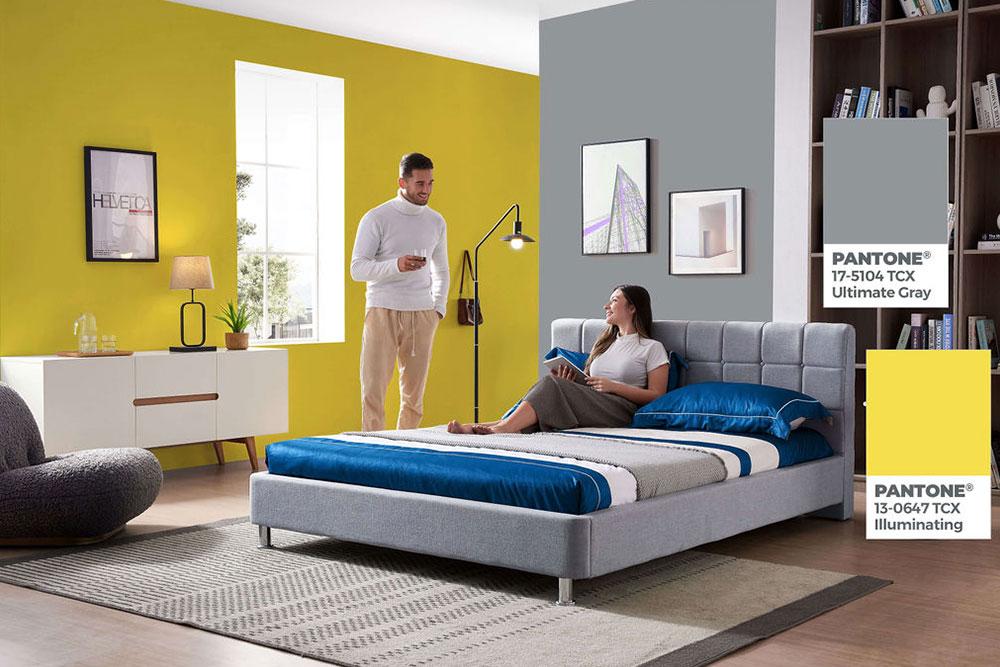
ULTIMATE GRAY – PANTONE® 17-5104 TCX
Ultimate Gray could not be more mix-n-matchable so you really have nothing to worry about and everything to gain by using it if you love it. It is both light enough to paint on walls, as well as, saturated enough to be used in art and textiles like rugs and upholstery. It falls dead center on the green-red spectrum (i.e., it neither advances nor retreats) and all but imperceptibly right of center on the blue-yellow spectrum … just enough to blend perfectly with Illuminating.
What we love about Ultimate Gray is how perfectly it matches or pairs with the grays we’ve chosen to offer for nearly every sofa, armchair, or sectional we sell at Valyou Furniture. As you can see, we’ve tried it alone (and paired with Illuminating) on walls, in flooring, rugs, and it’s a winner in every context.
MOVE OVER BLUE & GRAY, MAKE ROOM FOR SOMETHING BRIGHTER
The last few years have seen an explosion of grays in homes, more often than not paired with blues. It was lovely but now that we see Ultimate Gray paired with a bright sunny yellow, we know that the strictly blue-gray couple is ready to be expanded. Luckily, for those who already own (and love) blue decor, you need not let that stop you from adopting 2021’s colors of the year. Here we’ve paired our blue Valolam Compact Sectional with Pantone’s palette for this year and it looks fantastic.
PRO TIP #2: Cultivate Live Plants.
Both of Pantone’s® 2021 Colors of the Year are spectrally ideal for mother nature’s classic greens. Again, it’s a math and science thing but the light reflected and absorbed by Illuminating and Ultimate Gray will sing in perfect harmony with the greens in your houseplants and those found outside your windows. So, whatever your reason, this year will be a great time to green up your lawn, add oxygen to your air, spice up your food and celebrate with some happy, healthy houseplants and window box herb gardening.
We hope we’ve been able to inspire everyone who, like us, loves Pantone’s® Colors of the Year 2021 to go big and go home this year. If you’re looking for new furniture to support your bold new and modern home decor, pop into our store, in person or online, and check out the ways that our stuff is uniquely stylish and affordable. We believe you’ll find our innovations illuminating and our selection penultimate.
Do you agree with our assessments and suggestions? Did you find them helpful? Do you have some insight or suggestions of your own to share with our Valyou family? Let us know in the comments section.


Leave a comment
All comments are moderated before being published.
This site is protected by hCaptcha and the hCaptcha Privacy Policy and Terms of Service apply.