Using a variety of finishes in your decor makes a room more visually interesting. Tactile objects like fabric, stone, and wood all create texture in your space. As a design element, texture can add depth and dimension to a look. It can accentuate an object or area, and it can show personality inspired by your own unique creativity.
Tiffany Leigh, of Tiffany Leigh Design, explains: "Texture in interior design is all about creating tactile moments that invite touch. It refers to the feel, appearance, or consistency of a surface or material. Textures help to keep a space from feeling flat or one dimensional," (Homes and Gardens)
Texture comes in many forms and offers a wide range of attributes. Rough surfaces create more visual weight, while smooth textures can seem comforting. Shiny textures are more contemporary, and matte surfaces can be classic. Surprisingly, lighting can be used as a form of texture to create warmth or harshness. Textiles or objects with cushy exteriors can soften a room full of hard surfaces, like a kitchen or bathroom. There are unlimited uses for texture in interior design.
Why Texture Matters in Interior Design
Texture adds dimension and depth to a space and determines how a room feels. It can feel warm and cozy or cool and airy based solely on the surface finish of the objects in a room regardless of the actual temperature or presence of a breeze. The visual appearance of texture is just as significant as the tactile feel when it comes to influencing how it feels to be in a space. When designing your room, it's essential to look at the space as a whole rather than a collection of individual items. Without texture variation, a room can look and feel flat.
How to Add Texture
Texture exists in walls, floors, rugs, furniture, decor, art, light, structure, and architectural elements. There are countless ways to create and adjust the look and feel of a space with texture alone. While it can be fun to dive in and implement as much texture as possible, textures should be balanced and repeated in thoughtful ways.
1.Textured Furniture
The texture of furniture is especially significant because you are likely to touch and feel these surfaces more than any other decor piece. Think of the armrest of a bumpy boucle couch against your forearm. Now, think of the feel of soft, velvety microfiber instead. Imagine running your fingers over a warm wooden desk with a deep grain, and then imagine the feel of a cool, smooth, industrial metal finish instead. The classic white, fluffy, faux fur glam rug creates an entirely different feeling on your feet than carpet, hardwood, or an authentic cowhide rug.
Surfaces you touch often should be comfortable. Furniture that sees a lot of use should be durable. Materials like leather develop a patina over time, making your piece look better and better with age and high usage. Whatever functional needs you may have for your furniture, the pattern, feel, and texture should be expertly woven into the rest of your decor for a curated look.

The Ovo chair is a perfect example of mixing visual texture through contrasting materials. A soft, supple leather seat provides soft comfort and a medium gloss shine. On the exterior, aluminum offers durability and a similar medium gloss shine. Though the level of shine is the same, the two materials create a stark textural contrast due to patterning and feel.
2. Layering
In interior design, layering is a way to create deep, rich spaces. Throw pillows are a perfect example of layered texture. One pillow may have a slightly rough texture, another a satin finish, and another might have a fluffy fringe. They all work together because of color or pattern, but they are distinctly different because of their texture. This makes a room visually interesting and adds depth to space.
Every part of your space is an opportunity to create interest and depth through layers. Look for different sources of texture outside of fabric and furniture to make unique and exciting looks. Decor objects on bookcases tables, and walls can be smooth or bumpy, shiny or matte, fiber, metal, or ceramic.
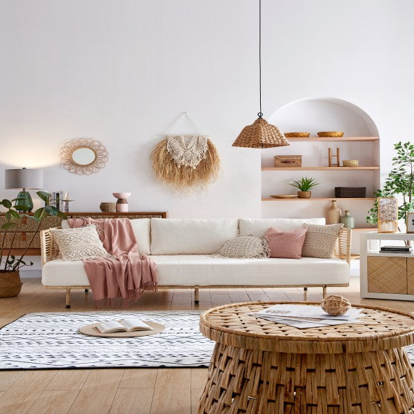
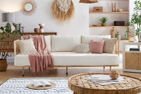
In this room, we see a base of natural textures from rattan, bamboo, and dried grasses. The macrame weave on the wall hanging and throw pillows mimic this texture yet keeps a distinct look. The room is accented with smooth surfaces found in the throw, sections of the end table, and the sofa. If you look close, there are a dozen or more unique textures, but it comes through like one complete piece when you look at the room as a whole.
3. Accessories
As a bare minimum, you want to be at least aware of textures when choosing accessories for your space. Think about how the finish will read in its place and among the other items in the room. If you are looking to go the extra mile:
- Plan your decor theme around varying or alternating textures.
- Use care not to implement too many competing patterns or to lump similar textures together.
- Refer to the structure of your color palette.
Designers suggest colors that complement each other. Even if one is an accent or meant to contrast, it will still have a similar undertone or value to the rest of the colors in the palette.

Blue and yellow are pretty far apart on the color wheel, so it can be hard to have them live in harmony. The above palette works because the blues are muted, so they don't compete with the vibrant yellow on the end. The bold yet low saturation gold color works to bridge the bright yellow and the lowkey blues.
You can use this pattern when planning textures as well. In this example, you would have three similar, tame textures, one eye-catching accent, and one that ties them all together.

In the above photo, we see the leather-bound books that anchor this look to the leather furniture in the room. Of course, the wooden slats on the bookcase feel different, but they share a similar visual texture with the leather books - smooth and low gloss. The wooden boxes are our third base layer (our blues from the color palette example). They are still wood but slightly more textured than the slats of the bookcase. The bust is our bright yellow from the color palette example, our accent. It has the most shine and the most intricate surface patterns. This is the object most likely to catch the eye before anything else. If we again refer back to our color palette example, our gold - the texture tying together the base and the accent, is the medium gloss shine of the white and grey books. Having glossed paper covers, they’re noticeably more shiny than the wood and the leather-bound books yet still considerably less shiny than our accent, the bust. Inter Design's Adonis Bust Sculpture at Valyou Furniture Learn more.
4. Lighting as Texture
It makes sense that your lighting source has texture, but most people don't realize that light itself is texture. Soft, warm light can almost feel cozy. Cool light is usually brighter, causing a space to feel harsher while adding a contemporary vibe. When intense light comes from one direction, it is piercing with defined edges; think of sunbeams. This creates hard lines in your space. Light coming from many sources can make an evenly lit room where light is not distinguishable or directional. Multiple light sources can also create light that seems to ebb and flow where some areas are rich with brightness, and others benefit from increased shadow.

You can get a good idea of how to implement the three types of interior lighting here. Once you know the basics, it's fun to play with how lighting as a texture can transform your space. You will be amazed at the ease with which you can change a room's whole mood by simply adjusting your lighting sources.
Show Us What You Got
The most important thing is that you enjoy the process, and you end up with a space that brings you happiness. If you find the design phase too stressful, then it's time to take a step back and enjoy what you currently have. The perfect room isn't built in a day. Take your time and add pieces as you see ones that feel right and fit your style. Whether you have an expertly curated pinboard or a loosely strung-together vision in your mind, design with intention in ways that work for you.
As you go through the process or when you feel it's complete, we would love to see what you come up with. Use #MyValyou on social to show off how you use texture when styling your rooms with your favorite Valyōu furniture. You can also see how others are styling their rooms around the same pieces.


Leave a comment
All comments are moderated before being published.
This site is protected by hCaptcha and the hCaptcha Privacy Policy and Terms of Service apply.